Cornucopia
Developed in Unreal Engine 5
Overview
Cornucopia is a narrative-driven RPG centered around a young wolverine named Wolvyn on his quest to seek out his grandfather. Blending exploration, dialogue, and turn-based combat, Cornucopia is inspired by the classic top-down RPG genre. I designed and implemented the game’s UX/UI and core gameplay systems, focusing on creating a cohesive and readable player experience across all game states.
Design Goals
The primary goal was to create a UI system that seamlessly supports transitions between exploration, dialogue, and combat without disrupting player immersion. I focused on maintaining clarity in a top-down perspective, reducing cognitive load during decision-making, and ensuring that key information is always accessible when needed.
Core Gameplay and UX Integration
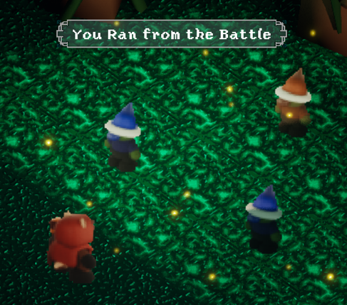
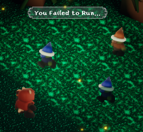
Cornucopia’s gameplay loop moves between exploration, narrative interaction, and turn-based combat. The UI adapts dynamically to each state—remaining minimal during exploration, expanding contextually during dialogue, and becoming more structured during combat to support strategic decision-making. This approach ensures that the interface complements gameplay rather than competing with it.
Battle System UX/UI
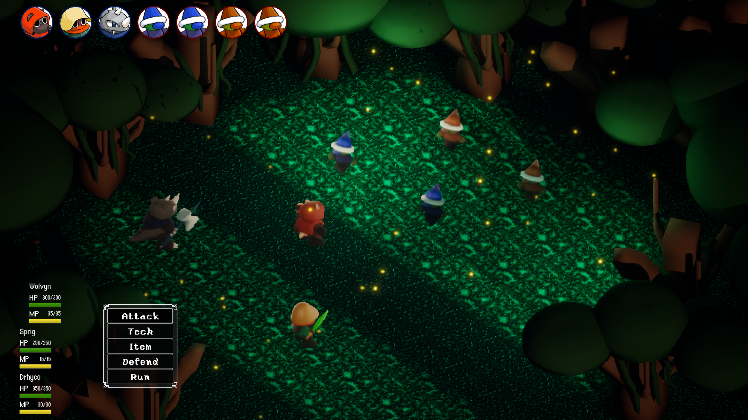
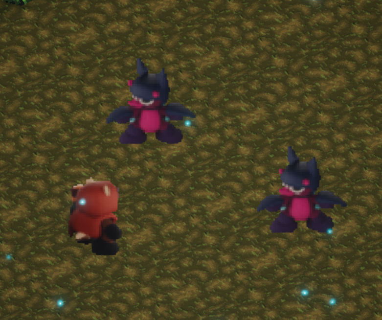
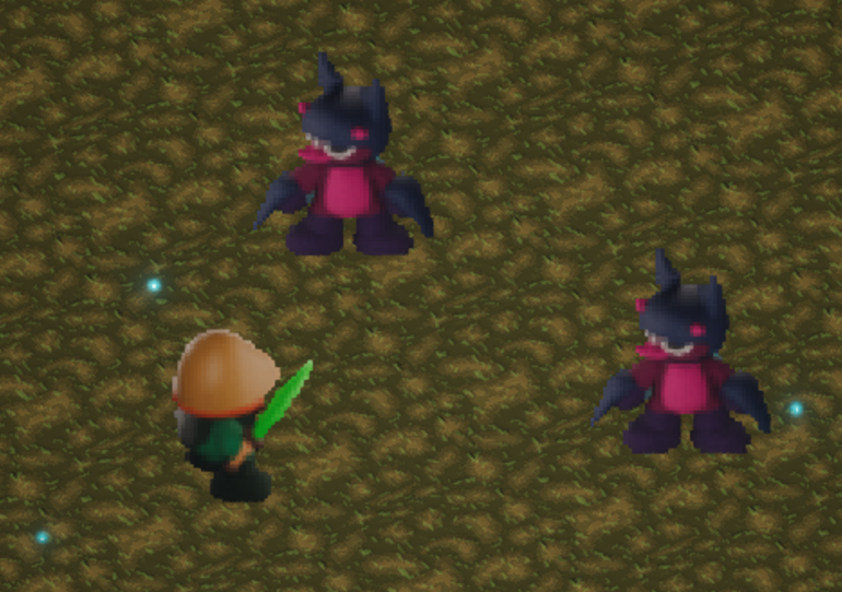
The combat interface was designed around clarity, hierarchy, and responsiveness. Player and enemy information is positioned to be immediately readable, while the action menu is placed for quick access and minimal input friction.
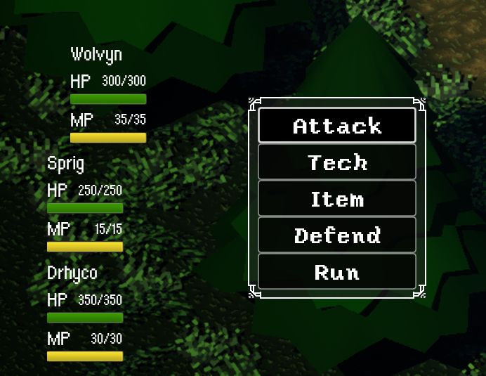
Main Battle Navigation
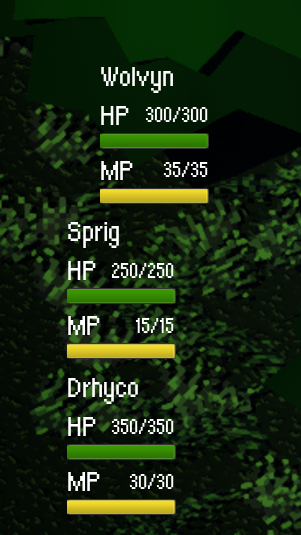
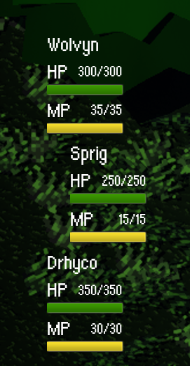
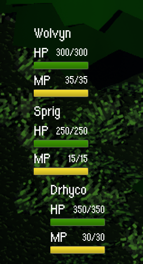
For the primary battle interface, player health and mana are positioned in the bottom-left corner alongside the action menu, creating a centralized area for decision-making. The menu presents five distinct actions, each offering a different strategic option within combat. Placing these elements in the bottom-left preserves the majority of the screen space, allowing players to maintain a clear view of the battlefield and better assess enemy positioning and context while making decisions.
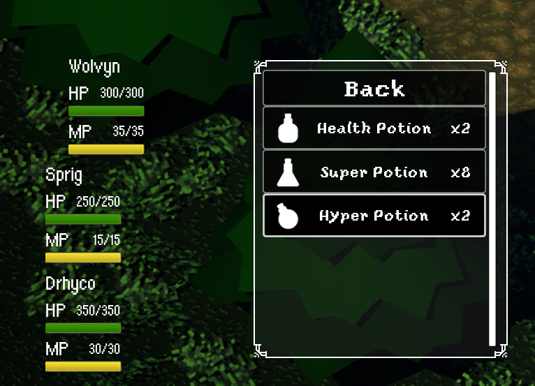
Main Item Navigation
The player can acquire a wide variety of items over time. As a a result, the inventory interface was designed with scalability in mind. The item menu supports expansion without compromising readability, using a structured list layout paired with a vertical scroll bar to accommodate growing content. This approach ensures that as the player’s inventory evolves, the interface remains organized, easy to navigate, and consistent, preventing clutter while maintaining quick access to important items during gameplay.
Responsive UI Elements
To enhance responsiveness and reinforce player feedback, the character’s status bar dynamically follows them when they move to the center of the battlefield to perform an action. While the character’s positioning already indicates their turn, this additional UI behavior provides a clearer visual cue, strengthening the connection between input and on-screen response. This subtle animation improves readability during combat and contributes to a more polished and immersive experience.
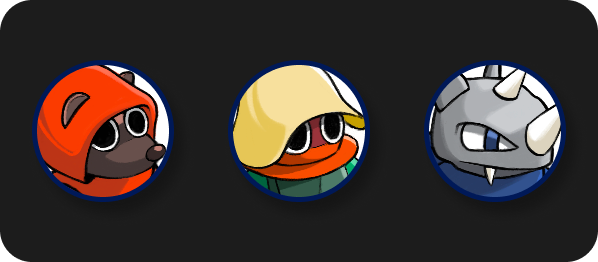
Player Icons
Icons used to determine the order in character goes
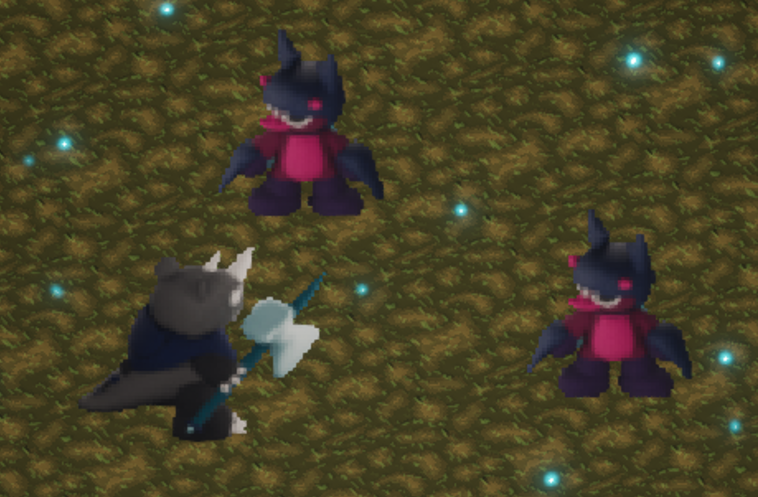
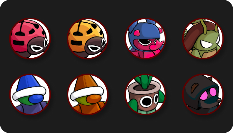
Enemy Icons
Battle Result Screen
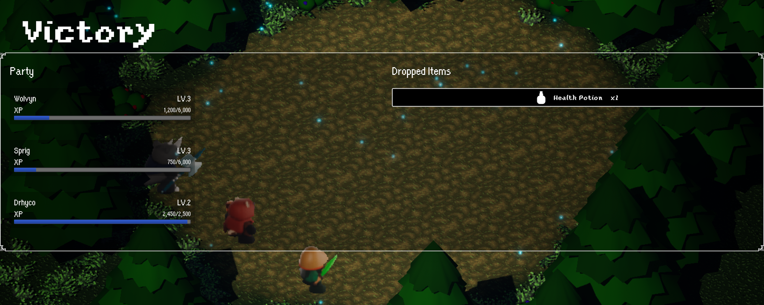
The results screen is designed to clearly communicate post-battle rewards through a balanced, two-column layout. On the left, party experience gains are displayed and updated in real time, allowing players to track progression and level growth at a glance. On the right, item drops are presented in a dedicated space, ensuring rewards are easy to identify without competing with progression information. This separation reinforces clarity and provides a satisfying, organized summary of the battle outcome.
The UX/UI during battles are designed to support decision-making under pressure. I prioritized clear visual grouping and intuitive navigation, allowing players to quickly understand available actions and outcomes. Transitions between turns are responsive and provide immediate feedback, reinforcing the flow of combat and maintaining engagement.
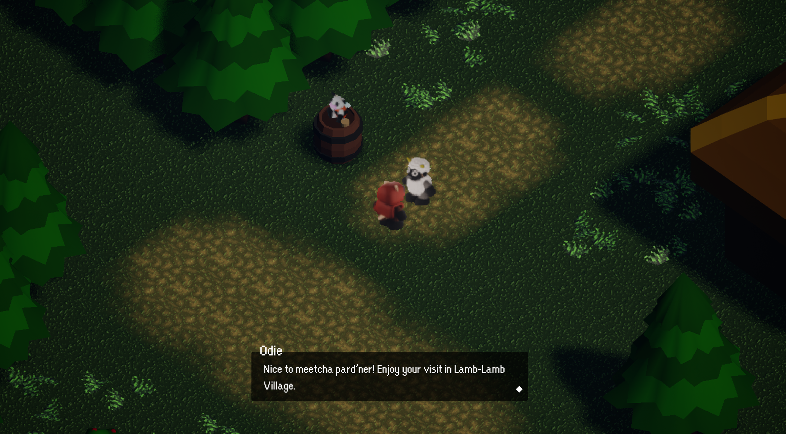
Dialogue System
The primary goal was to create a UI system that seamlessly supports transitions between exploration, dialogue, and combat without disrupting player immersion. I focused on maintaining clarity in a top-down perspective, reducing cognitive load during decision-making, and ensuring that key information is always accessible when needed.
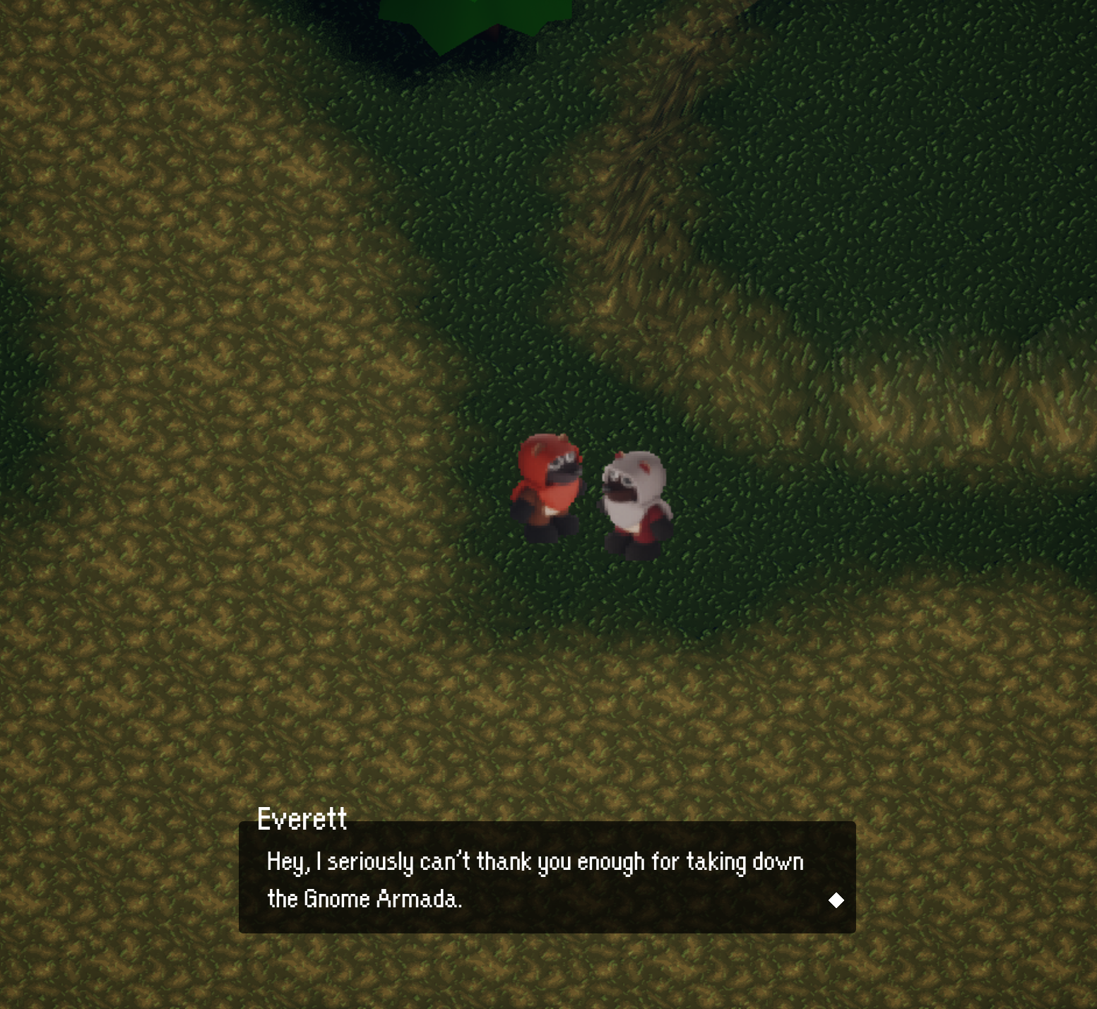
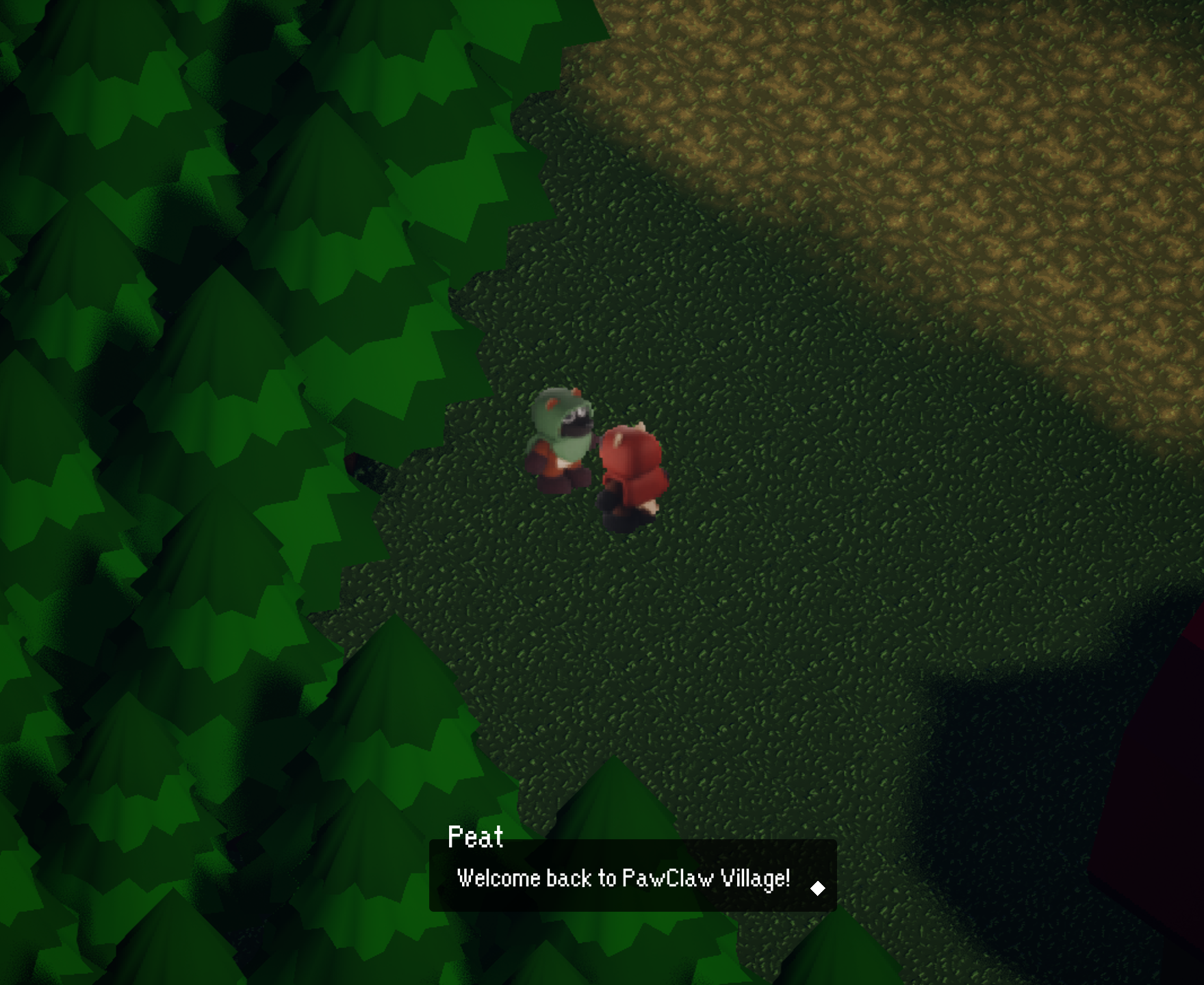
The dialogue system also incorporates a responsive text box that adjusts dynamically based on the amount of text being displayed. Rather than relying on a fixed size, the container expands or contracts to fit the content, maintaining consistent spacing and readability. This ensures that shorter lines feel concise while longer dialogue remains clear and well-structured, improving overall pacing and presentation without overwhelming the player.
Menu & Save Systems
The menu and save interfaces were designed for efficiency and clarity, allowing players to navigate options and manage progress with minimal friction. Information is organized hierarchically, ensuring that essential actions. Saving, loading, and accessing inventory are intuitive, quick, and easy to access.
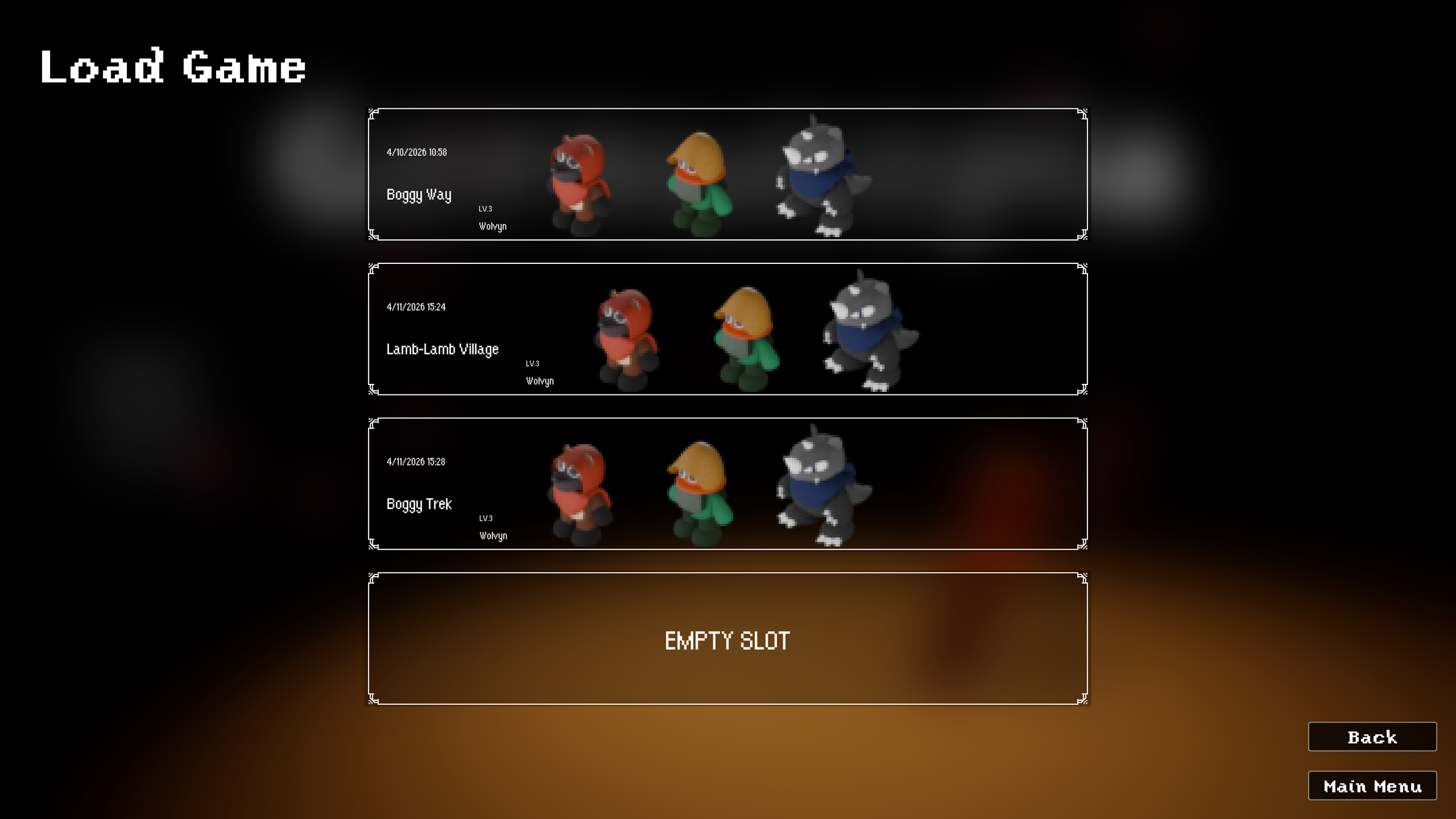
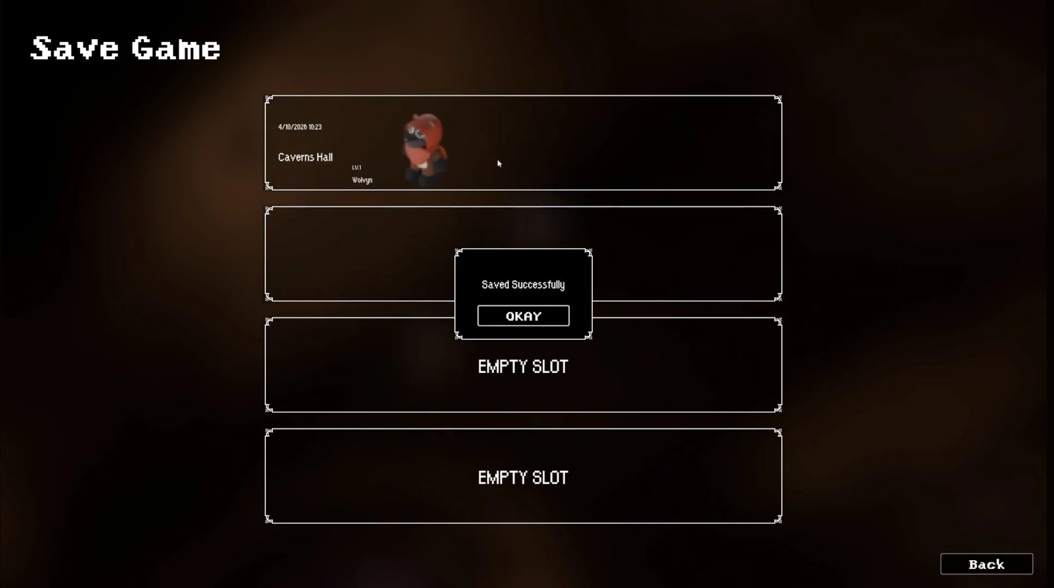
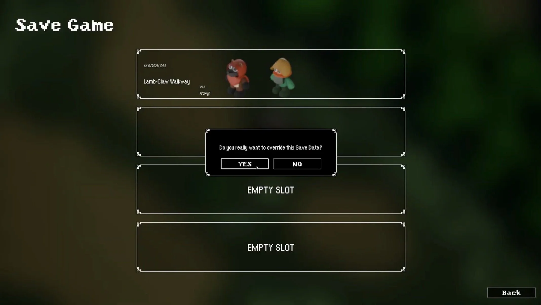
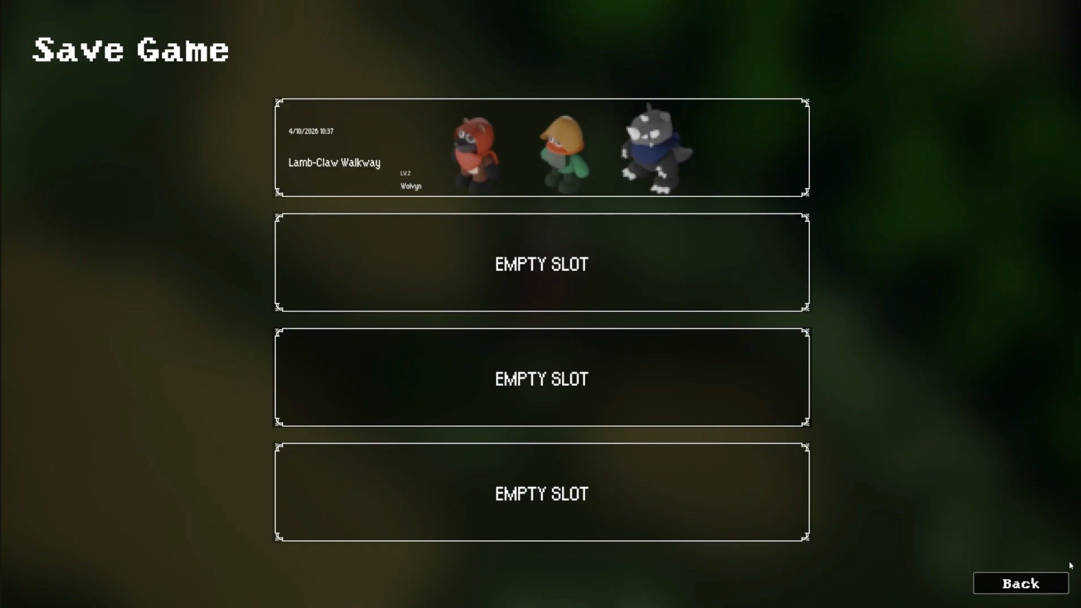
The save menu is designed to provide clarity and control over player progress. From the file selection screen, players can create or overwrite saves, with a confirmation prompt ensuring intentional actions before replacing existing data. Each save file presents key information at a glance. This information includes the date and time, current in-game location, player level, and active party size. Displaying this information allows players to quickly identify and manage their progress with confidence.
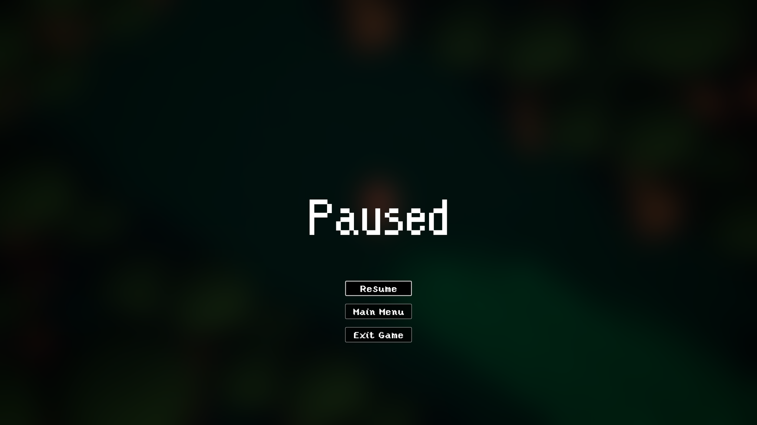
Pause Menu
Feedback & Notifications
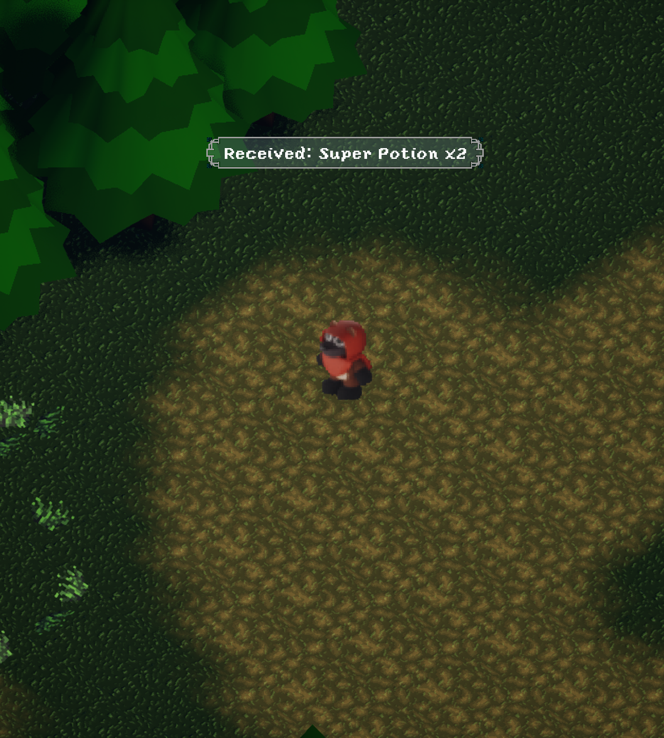
To reinforce player actions, I designed contextual UI elements such as item pickup notifications and area transition widgets. These elements provide immediate feedback without interrupting gameplay, ensuring that players remain informed while maintaining immersion.
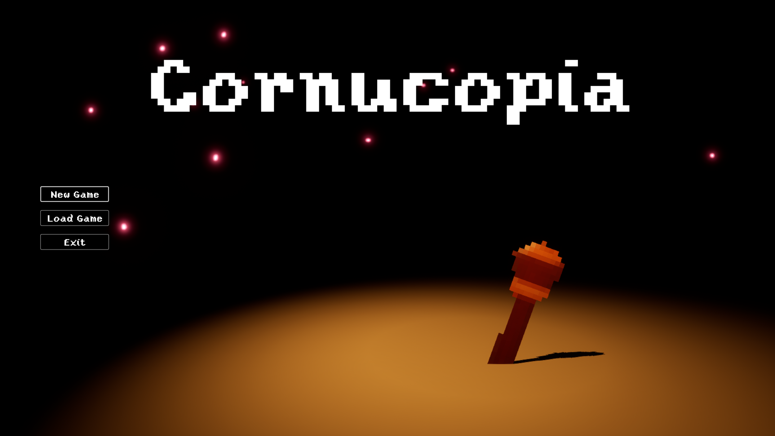
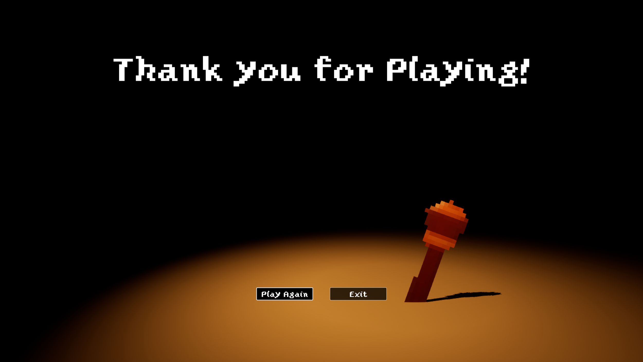
Title & End Game Screens
The title and end game screens establish the tone of the experience and provide clear entry and exit points for the player. The title screen prioritizes simplicity and navigation clarity, while the end game screen delivers closure through a focused and streamlined presentation.
Closing Out
Throughout development, I iterated on UI layouts to improve readability and reduce clutter, particularly within the battle system. Early designs presented too much information at once, which slowed decision-making; refining the layout and hierarchy resulted in a more streamlined and responsive experience.
This project strengthened my ability to design UI systems that adapt to different gameplay states while maintaining consistency and clarity. It also reinforced the importance of aligning UX decisions with core gameplay mechanics to create a cohesive player experience.
Cornucopia represents a comprehensive exploration of UX/UI design with a focus on gameplay, where every interface element is shaped by player needs and system interactions. By aligning visual clarity, responsiveness, and game design, this project demonstrates my ability to create intuitive and cohesive user experiences across multiple gameplay states. It serves as a reflection of both my technical execution and my approach to designing interfaces that enhance the player experience.
Cornucopia - Full Walkthrough
Ty Cueva 2026